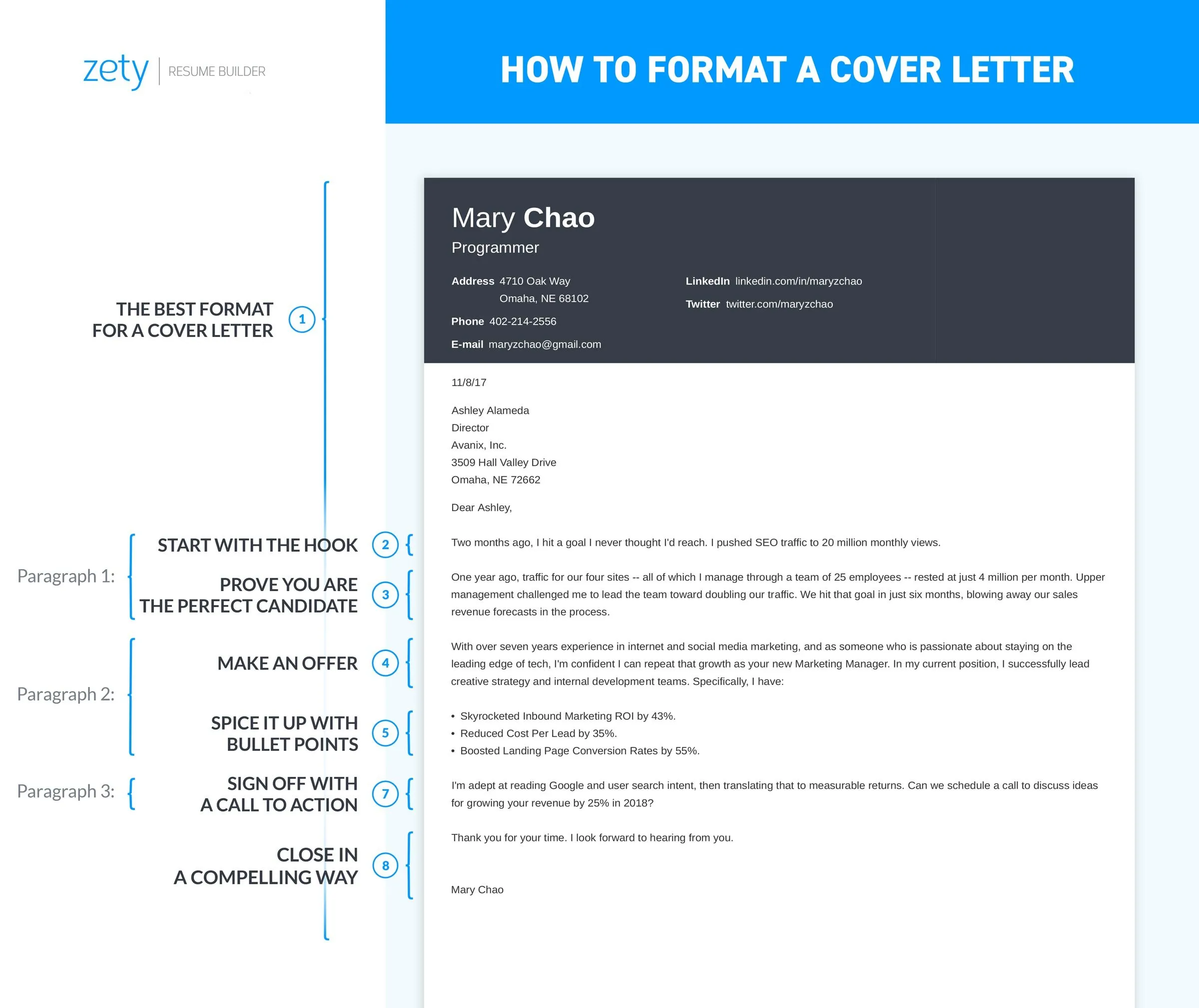
Cover Letter Fonts Top 5 Choices
Your cover letter is your first impression, and the font you choose plays a significant role in how you are perceived. Selecting the right font and font size can make your cover letter easy to read, professional, and engaging. In this guide, we’ll explore the top five font choices for your cover letter, along with essential tips on font size, formatting, and best practices. Remember that the goal is to make your cover letter as easy to read as possible while projecting an image of professionalism. Choosing the right font is essential for readability and visual appeal. Let’s dive into the best font choices for your cover letter.
Serif Fonts for Cover Letters
Serif fonts are characterized by the small strokes or ‘serifs’ at the end of each letter. They offer a classic, traditional look that can make your cover letter feel trustworthy and authoritative. Serif fonts are often favored for printed documents because the serifs help guide the reader’s eye across the page. These fonts can convey a sense of formality and attention to detail, which can be particularly useful for roles in industries such as finance, law, or academia. When choosing a serif font, consider its legibility and how well it represents your professional image. Serif fonts, with their traditional appeal, can be a solid choice for cover letters. But, ensure the font is easily readable on all devices.
Times New Roman
Times New Roman is a classic serif font, widely used for its readability and professional appearance. It’s a safe choice, suitable for almost any industry. The familiarity of Times New Roman means it’s unlikely to distract from the content of your cover letter. However, its widespread use means it might not help you stand out. It is a good starting point if you’re unsure, but consider whether you want to project a more distinctive image. Times New Roman is a good font, but it might not always be the most unique choice for your cover letter.
Georgia
Georgia is another excellent serif font. It is slightly bolder than Times New Roman and has a high x-height, making it exceptionally readable, even at smaller sizes. Georgia’s robust design makes it suitable for digital viewing, so it’s a great choice if your cover letter is likely to be viewed on a screen. It is slightly more modern-looking than Times New Roman, providing a good balance of professionalism and readability. Georgia is especially useful if you are sending your cover letter electronically. This font ensures that your content remains readable across various digital devices and resolutions. Remember, readability is crucial when conveying your qualifications.
Sans-Serif Fonts for Cover Letters
Sans-serif fonts lack the small strokes found in serif fonts. They offer a clean, modern look, often associated with innovation and simplicity. Sans-serif fonts are particularly effective for cover letters that need to appear contemporary or are designed to be viewed primarily on screens. These fonts can convey a sense of approachability and straightforwardness. They are a great way to communicate a modern and clean aesthetic. The key is to choose a font that is clear, readable, and in line with your overall professional image. Sans-serif fonts are an excellent choice for a contemporary look. When choosing a sans-serif font, consider its readability on screens.
Arial
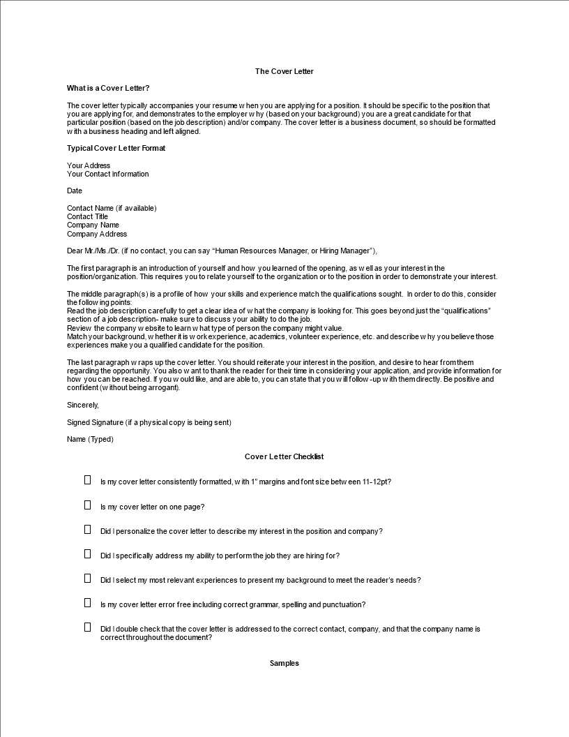
Arial is a widely recognized sans-serif font, known for its simplicity and clarity. Its straightforward design ensures easy readability. Its neutral appearance means it’s suitable for almost any professional field. Arial is a great option if you want a font that is unobtrusive and lets the content of your cover letter take center stage. The lack of serifs provides a clean look that’s perfect for digital applications. It is a reliable font that presents a modern, clean impression.
Helvetica
Helvetica is another highly versatile sans-serif font, celebrated for its legibility and polished appearance. It’s slightly more sophisticated than Arial, making it a good choice for cover letters that require a touch of elegance. Its clean lines and consistent weight create a professional and modern aesthetic. Helvetica is a popular choice in graphic design. So it conveys a sense of thoughtfulness. Helvetica is a great option if you want to communicate a sense of professionalism and attention to detail, as it is highly readable and aesthetically pleasing. This is another font that ensures your cover letter remains accessible and visually appealing on various devices.
Other Recommended Fonts
While Times New Roman, Georgia, Arial, and Helvetica are safe bets, other fonts can also work well, depending on your industry and personal preference. Consider Calibri (sans-serif) or Garamond (serif), which offer excellent readability and a slightly more distinctive look. Always ensure your chosen font is easily readable and professional. Experiment with different fonts to see what best complements your content and reflects your personality. The most important thing is to choose a font that presents your cover letter in the best possible light. The other recommended fonts, such as Calibri and Garamond, provide different options for your cover letter.
Choosing the Right Font Size
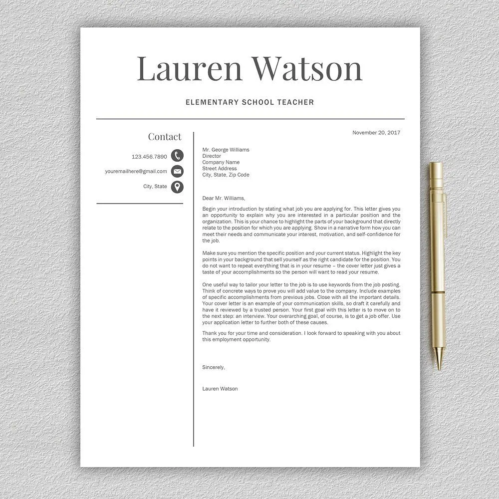
The font size you choose plays a crucial role in the readability of your cover letter. The optimal font size will ensure that your cover letter is easy to read and visually appealing. Using an appropriate font size demonstrates professionalism and attention to detail. The general recommendation for cover letters is to use a font size between 10 and 12 points. This size range is typically the most readable and professional. Consider your audience and the platform they’ll be using to view your cover letter. Readability is key to ensuring your cover letter makes a good impression.
Font Size Best Practices
The best font size for a cover letter is typically between 10 and 12 points. This range provides an easy-to-read experience. Ensure that the font size is consistent throughout the document. Use slightly larger sizes for your name, the date, and section headings to improve readability. Avoid using excessively large or small font sizes. These sizes can make the document look unprofessional. Maintain consistency to convey a professional image. The font size should be consistent throughout the document to maintain a professional appearance. Inconsistencies can distract the reader and diminish your presentation.
Font Size for Readability
Readability is the most important factor when selecting a font size. A font size that is too small will strain the reader’s eyes, while a size that is too large can make your cover letter appear cluttered. Stick to a size that is comfortable to read on a standard A4 or letter-sized page. Test your cover letter by printing it or viewing it on different devices to ensure readability. Choosing the appropriate font size ensures that your cover letter is easy to read. The goal is to make it easy for a recruiter to consume the information. Make sure the font size is appropriate for both print and digital use. Consider the readability on different devices.
Font Size for Professionalism
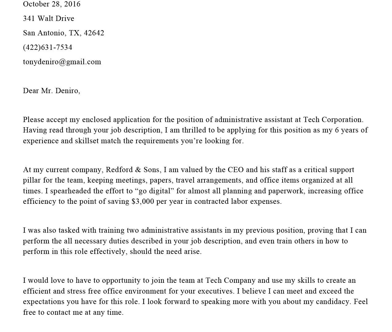
The font size should reflect a professional appearance. A well-formatted cover letter demonstrates attention to detail. Avoid using font sizes that are too bold or look unprofessional. The font size you choose contributes to your overall presentation and how you’re perceived. Ensure your cover letter projects the right image by adhering to professional standards. Use appropriate font sizes to convey a professional image. Always choose a readable font size, which is a critical factor for a professional look. It is important to use a font size that looks professional and reflects your attention to detail.
Font Size for Different Sections
While the body of your cover letter should typically be between 10 and 12 points, you can adjust the font size for different sections to enhance readability and organization. You may use a slightly larger font size (e.g., 14 points) for your name and contact information at the top. Also use slightly larger sizes for section headings (e.g., 12-14 points) to make them stand out. This hierarchical approach helps the reader navigate the document more easily. This strategic use of font sizes guides the reader’s eye and emphasizes important information. Varying the font size helps organize your cover letter. Use slightly larger fonts for headings and your contact details. This technique enhances readability and structure.
Formatting for Cover Letter
In addition to choosing the right font and size, formatting your cover letter correctly is essential to enhance readability and professionalism. The layout of your cover letter should be clean, uncluttered, and easy to navigate. Proper formatting shows your attention to detail and commitment to presenting your best self. Maintaining a polished format is crucial for making a positive impression. The layout should highlight your professionalism and attention to detail. Proper formatting enhances readability and creates a positive impression.
Alignment of Cover Letter
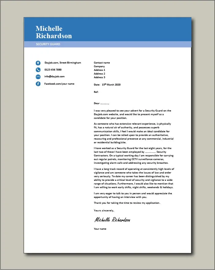
Align your text consistently. Left-aligned text with a ragged right edge is generally the most professional and readable option for the body of your cover letter. Avoid justifying the text, as this can create uneven spacing between words, making it difficult to read. Keep the date, your contact information, and the recipient’s details aligned to the left or right. Consistency in alignment ensures a polished and professional appearance. Consistent alignment helps to create a polished and professional document. Left alignment is often the best option for the body of your cover letter.
Spacing of Cover Letter
Use single or 1.15 line spacing for the body of your cover letter. Double spacing is usually too much and can make the document appear long and unwieldy. Proper spacing improves readability. Ensure there’s enough space between paragraphs to visually separate the different sections. Maintain consistent spacing throughout your cover letter. Consider adding extra space between the sections to enhance readability. Proper spacing enhances readability and makes the document look organized. Maintain consistency in line spacing throughout the document.
Margins of Cover Letter
Set margins to one inch on all sides. This provides enough white space to make your cover letter visually appealing. Adequate margins also prevent the text from appearing cramped and allow for easy printing. Margins create visual breathing room. This makes the document easier to read. Avoid margins that are too narrow. Also avoid those that make the text look cramped. Consistent margins contribute to a professional look. Set your margins to one inch on all sides for a professional appearance. Appropriate margins improve readability and allow space for comments.
Tips for Choosing the Best Fonts and Sizes
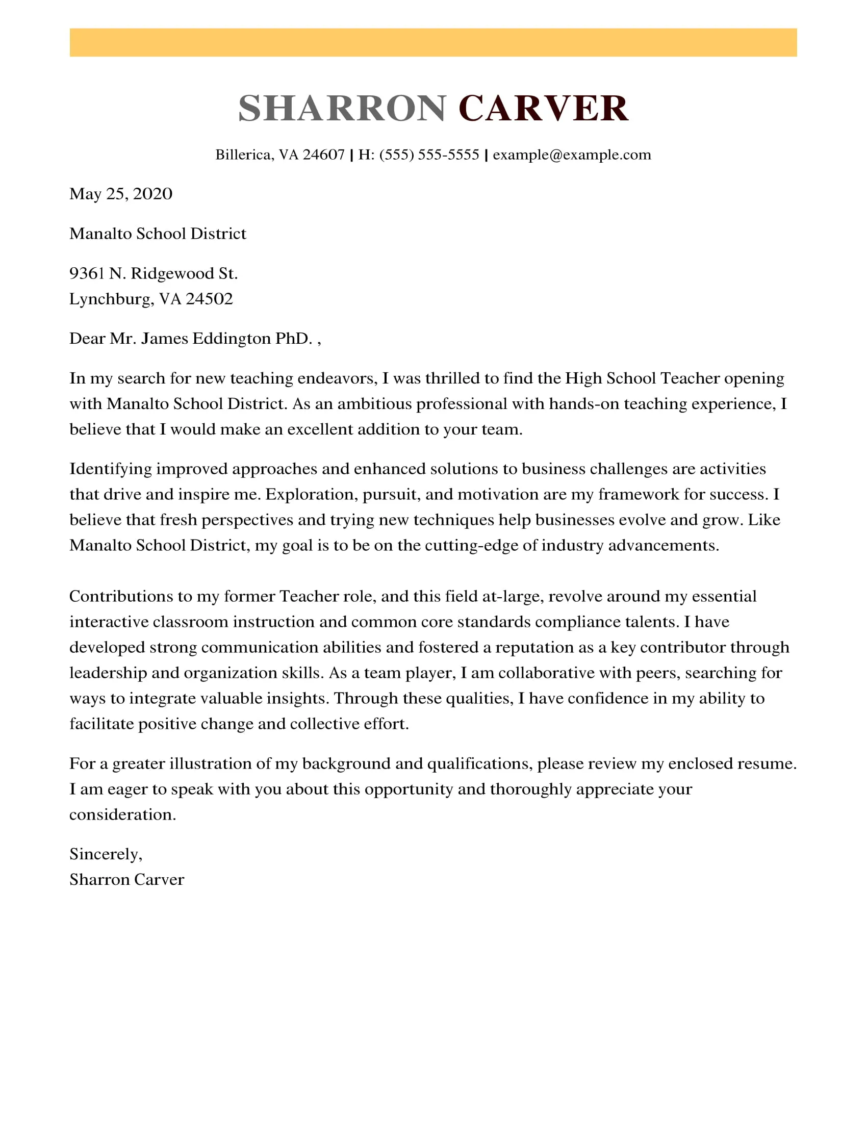
When selecting a font and font size for your cover letter, always consider the industry and the specific job. Some industries have specific preferences or expectations. Tailor your choices to match the tone and culture of the company you are applying to. Ensure that your chosen font is easily readable on various devices, including computers, tablets, and smartphones. The font should render well, regardless of how the recipient views it. Proofread your cover letter carefully to catch any typos or formatting errors. Ensure your document is polished and error-free. Proofread to eliminate errors and inconsistencies. Always proofread your document. Your chosen font should be professional, readable, and appropriate.
- Choose fonts based on industry standards.
- Prioritize readability across all devices.
- Proofread your document for errors.
- Ensure your font reflects your personal brand.
- Keep your cover letter concise and to the point.
