Introduction
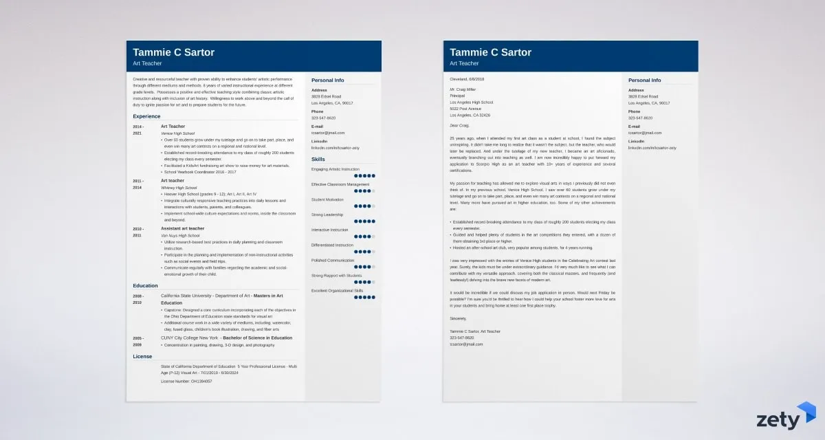
Your cover letter is your first impression. It’s the gateway to showcasing your qualifications, personality, and enthusiasm for a job. But beyond the words you choose, the font you select plays a crucial role in how your letter is perceived. A well-chosen font enhances readability, conveys professionalism, and subtly influences the reader’s impression of you. Choosing the right font can be the difference between your application being read or instantly discarded. This guide explores the best fonts for cover letters, ensuring your application stands out for all the right reasons. We’ll delve into why font choice is significant, the characteristics of each font, and tips on using them effectively. Ready to make a great first impression?
Understanding Font Impact on Cover Letters
The font you use in your cover letter is more than just a stylistic choice; it’s a reflection of your attention to detail and your understanding of professional communication. Fonts influence how your content is received, affecting readability and the overall impression you make. Think of your cover letter as a visual document, where the font acts as a silent communicator, either supporting or detracting from your message. The right font choice ensures your letter is easy to read, conveys professionalism, and aligns with the tone of your application. It’s a subtle but powerful tool in your job-seeking arsenal.
Why Font Choice Matters
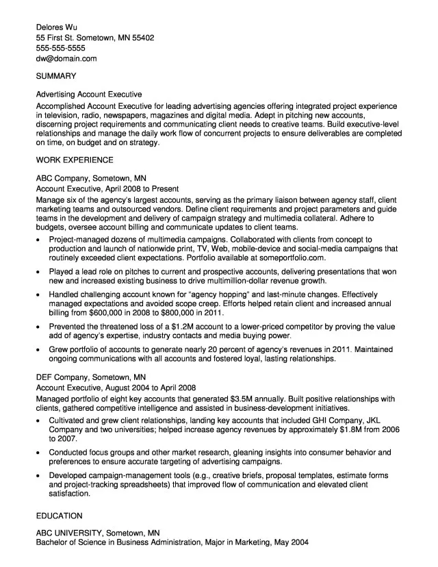
Font choice impacts how recruiters and hiring managers perceive your application. It affects their ability to quickly and comfortably read your cover letter, which is crucial when they are reviewing numerous applications. A poorly chosen font can strain the reader’s eyes, making it more difficult to focus on your qualifications and experiences. A font that is too ornate, unconventional, or small can distract from the content, potentially leading to your application being overlooked. Choosing the right font shows that you care about the presentation of your application and pay attention to details, which are valued qualities in any professional setting.
Readability and Professionalism
Readability is paramount in a cover letter. You want the hiring manager to easily absorb your key qualifications, experiences, and enthusiasm. A readable font ensures that your letter is easy on the eyes, allowing the reader to quickly scan and understand your message. Professionalism is equally important. The font you choose should align with the tone of your application and the industry you are applying to. It must convey competence, seriousness, and attention to detail. Fonts with clean lines and a classic appearance often achieve this, while fonts that are too casual, handwritten, or overly stylized can undermine your professionalism.
Top 5 Cover Letter Fonts
Choosing the right font for your cover letter is essential for making a positive impression. Here’s a look at the top 5 fonts that are widely accepted and recommended for cover letters, focusing on their readability and professional appeal.
Arial
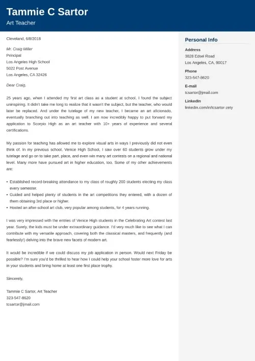
Arial is a widely used sans-serif font, known for its clean and straightforward appearance. It’s a versatile choice that works well for various industries and job applications. Its clear letterforms ensure high readability, making it easy for the reader to quickly scan and understand your content. Arial’s simple design conveys professionalism without being overly formal, making it a strong choice for most cover letters. Its widespread use ensures that it will display correctly on any computer or device, making it a universally accessible font.
Why Arial Works
Arial’s popularity stems from its excellent readability. The sans-serif design means the letters do not have small strokes (serifs) at the ends, resulting in a modern and uncluttered look. This makes Arial especially effective for on-screen viewing, which is how most cover letters are initially viewed. Its balanced proportions and clear letterforms make it easy on the eyes, allowing the reader to focus on your qualifications and experiences. Additionally, Arial’s familiarity makes it a safe and reliable choice, demonstrating professionalism without distracting the reader with an unusual font.
Tips for Using Arial
When using Arial, maintain a font size between 10 and 12 points to ensure readability. Use standard line spacing (1.0 or 1.15) to provide enough space between lines of text, improving readability. Avoid bolding large blocks of text; instead, use bolding sparingly to emphasize key points. Ensure that your Arial font is consistent throughout your cover letter, maintaining the same size and style for all text. Consider using Arial in both your cover letter and resume to provide a cohesive look, demonstrating your attention to detail.
Times New Roman

Times New Roman is a classic serif font that offers a traditional and professional appearance, making it a good choice for many cover letters. The serif design, with small strokes at the ends of the letters, guides the reader’s eye and enhances readability in printed documents. Though its use is becoming less common than in the past, it remains a strong option for those who want to convey a sense of formality and reliability. Its timeless design and widespread availability make it a safe and dependable choice for your cover letter.
Why Times New Roman Works
Times New Roman’s history and widespread use contribute to its professional reputation. The serif design enhances readability, especially in print, guiding the eye across the page. This font evokes a sense of authority and tradition, making it suitable for formal industries such as law, finance, and academia. It’s a familiar font, which can be advantageous because readers are used to seeing it, allowing them to focus on your content. It is a versatile option that works well for both printed and digital applications.
Tips for Using Times New Roman
To optimize readability, use a font size between 11 and 12 points. Ensure adequate line spacing (1.0 or 1.15) to avoid a cramped appearance. While the font is traditional, avoid overuse of bold or italic formatting to maintain a clean appearance. When submitting your cover letter online, ensure that the font displays correctly by saving your document in a universally compatible format such as PDF. If the industry or company has a specific font preference, consider it and use Times New Roman only if it aligns with those preferences.
Calibri
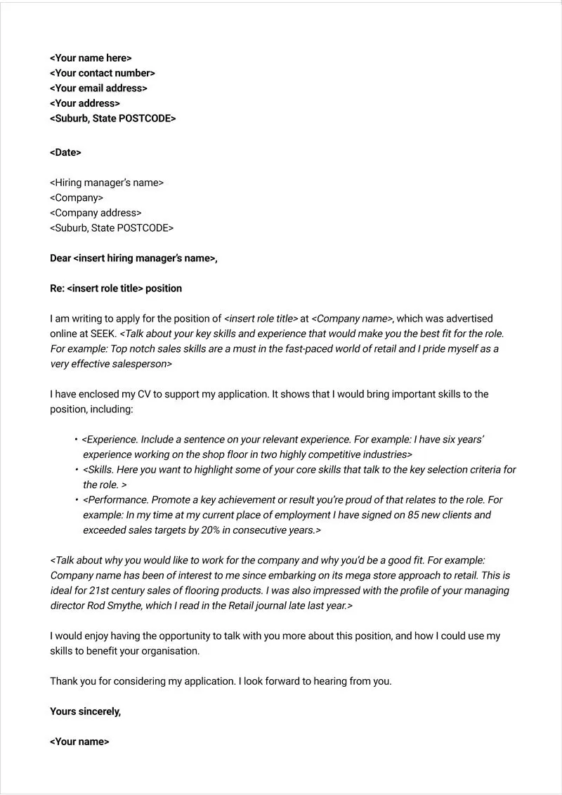
Calibri, a sans-serif font, is a modern and clean option, known for its excellent readability on screen. As a default font in Microsoft Office, it is a safe and familiar choice, widely used across different industries. Its rounded letterforms give it a slightly softer appearance than Arial, making it a versatile font suitable for various professional environments. The clarity of Calibri makes it ideal for digital viewing, ensuring that your cover letter looks clean and professional on any device.
Why Calibri Works
Calibri’s modern design and excellent readability make it a popular choice. Its balanced proportions and clear letterforms are easy on the eyes, making it easy for the reader to scan and understand your cover letter. It offers a contemporary aesthetic, which is suitable for modern workplaces and various industries. It’s a default font in many applications, guaranteeing compatibility and consistent display across different platforms and devices. Calibri is perceived as professional, readable, and accessible, making it a safe choice.
Tips for Using Calibri
Use a font size of 11 points for optimal readability. Maintain standard line spacing (1.0 or 1.15) to provide sufficient space between lines. Calibri looks best when used consistently throughout your cover letter, with similar sizes and styles. Avoid excessive bolding or italicizing to keep the design simple and clean. Check how your cover letter appears on different devices and platforms to ensure it displays consistently and professionally.
Helvetica
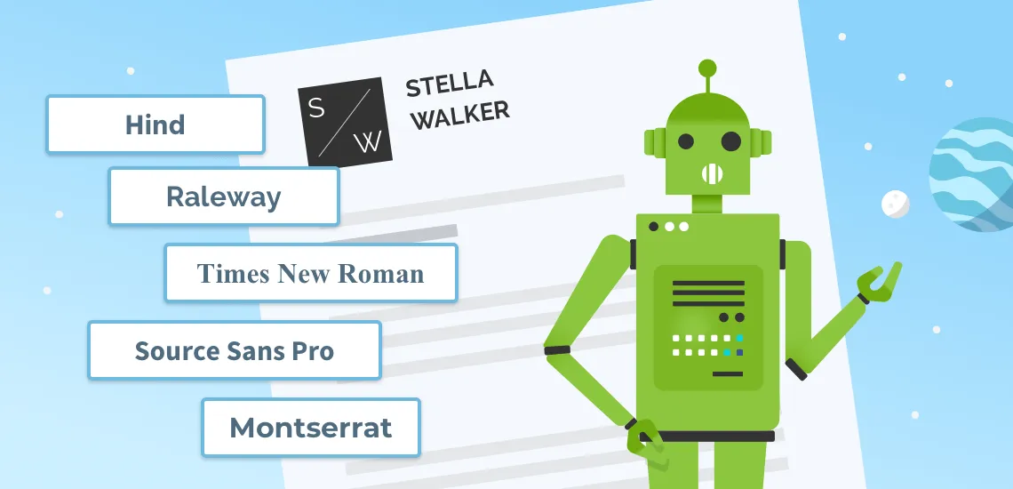
Helvetica is a widely recognized and versatile sans-serif font, prized for its neutrality and clarity. Its clean lines and simple design make it a highly readable choice for various applications, including cover letters. Helvetica conveys a sense of professionalism and is suitable for a wide range of industries and job types. Its widespread availability and compatibility guarantee a consistent display across all devices, ensuring your cover letter presents itself well.
Why Helvetica Works
Helvetica’s clean and uncluttered design ensures excellent readability. The absence of serifs gives it a modern feel, and the even stroke weights of the letters contribute to its clarity. Its neutrality allows it to be suitable for almost any professional setting, making it a dependable choice for your cover letter. Helvetica’s design ensures that the reader focuses on your message rather than the font itself. Its widespread recognition also means it is easily recognizable and trusted.
Tips for Using Helvetica
Choose a font size between 10 and 12 points to optimize readability. Use standard line spacing (1.0 or 1.15) to ensure the text is well-spaced. Maintain consistency in font size and style throughout your cover letter. Avoid overusing bold or italic styles, as they can make the text appear cluttered. When saving your cover letter, make sure to use a format that preserves the font’s appearance, such as PDF, to guarantee the font’s display consistency.
Georgia
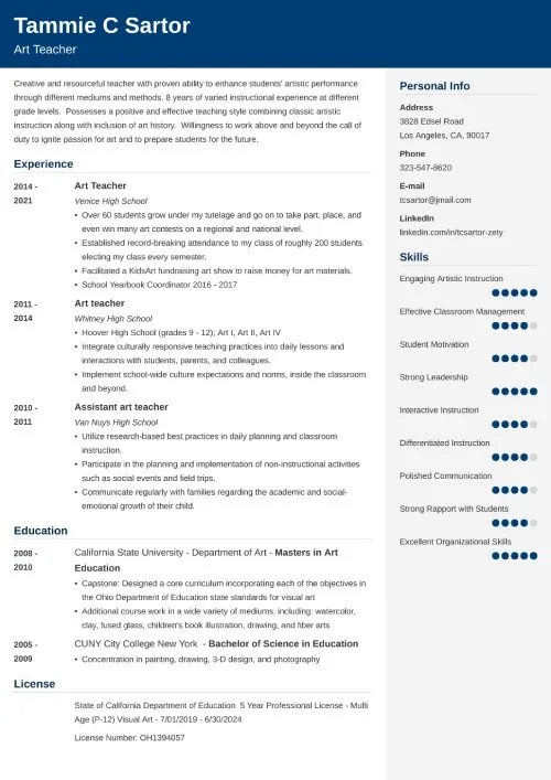
Georgia, a serif font, provides an excellent balance of readability and elegance, making it a strong choice for cover letters. Designed for readability on computer screens, it is often preferred for its clear letterforms and slightly larger x-height, which makes it easier to read at smaller sizes. It provides a professional appearance while being less formal than Times New Roman. Its versatility ensures that your cover letter will be well-received in a variety of professional settings.
Why Georgia Works
Georgia’s design prioritizes readability, particularly on screens. The slightly larger x-height and distinct letterforms improve clarity, making it easy for the reader to understand your content. It’s more modern and less formal than Times New Roman, making it suitable for various industries. The font conveys a sense of sophistication while maintaining accessibility, making it a great balance. It is a reliable choice for cover letters, ensuring your application is both readable and professional.
Tips for Using Georgia
Use a font size between 11 and 12 points to maximize readability. Maintain standard line spacing (1.0 or 1.15) to enhance the text’s clarity. Georgia’s design complements moderate use of bold or italic styles to emphasize key points. Confirm that your document is saved in a format like PDF to ensure the font is displayed correctly on any device. Ensure you use a consistent style throughout your cover letter, including matching font sizes and spacing.
Conclusion
Choosing the right font for your cover letter is a subtle but crucial step in creating a professional impression. The best fonts are readable, convey professionalism, and are suitable for your industry. By understanding the characteristics of each font and using them effectively, you can enhance the overall impact of your application. Prioritizing readability and choosing fonts that reflect professionalism helps you to make a great first impression on potential employers.
Recap of Top Font Choices
The top font choices include Arial, Times New Roman, Calibri, Helvetica, and Georgia. These fonts have different strengths but share common traits such as readability, professional appearance, and widespread availability. Consider your industry, the job you are applying for, and your personal preference when choosing from these options. Testing out these fonts in your cover letter can help you determine which font best suits your needs and creates the best first impression.
Final Thoughts on Font Selection
When selecting a font, consider the recipient of your cover letter and choose a font that will portray you favorably and make you appear professional. The goal is to create a document that is easy to read, visually appealing, and representative of your skills and abilities. While the fonts discussed here are excellent choices, your personal preference also matters. Ultimately, the best font is one that helps you clearly and confidently convey your message to the reader, increasing your chances of landing an interview. By making a thoughtful font choice, you demonstrate attention to detail and a commitment to presenting your best self.
